Storybook Alert Component
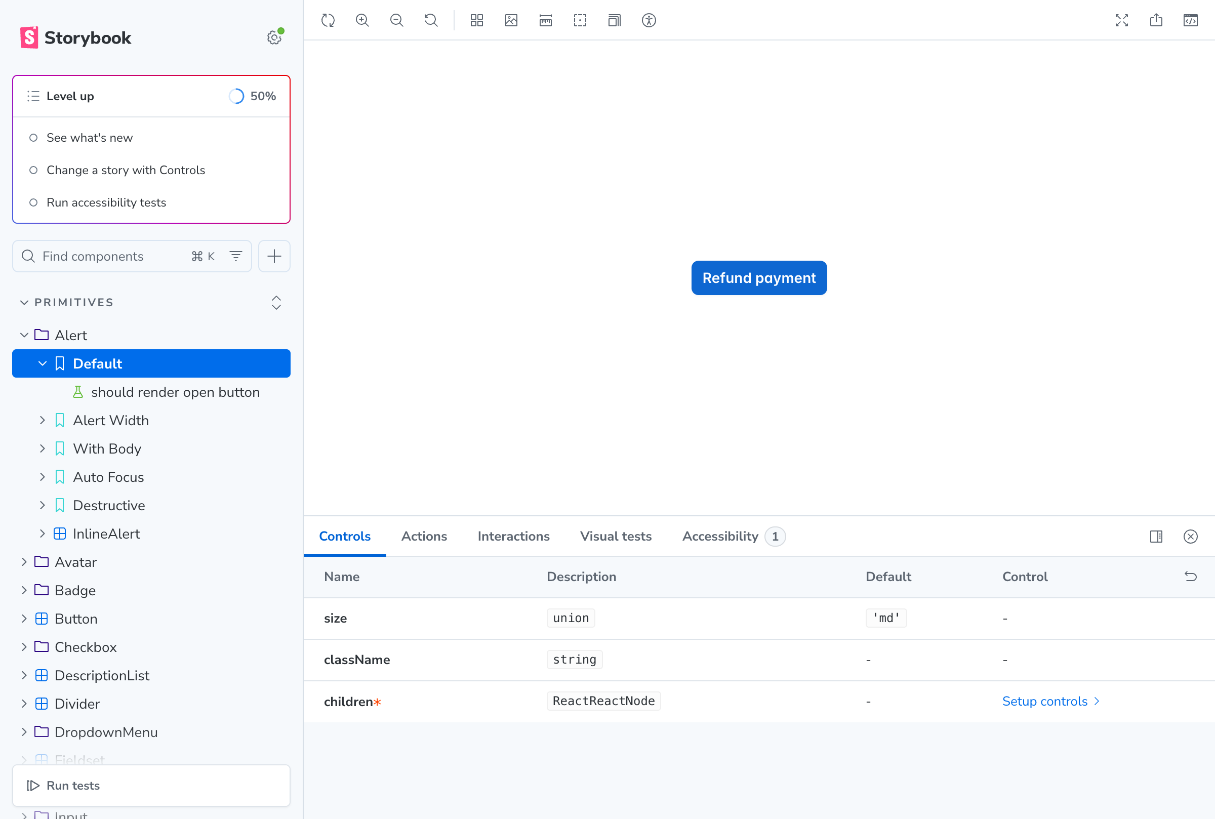
Screenshot of the Alert component in Storybook showing the Default story with controls panel.
Alert Component Preview
Component Details
- -
Component: Alert (Primitives)
- -
Story: Default
- -
Controls: size (md), className, children
Available Stories
- Default
- Alert Width
- With Body
- Auto Focus
- Destructive
- InlineAlert